When beginners start creating layouts with CSS, they often struggle with alignment, spacing, and positioning of elements. Questions like “How do I center a div?” or “How do I place items in one line?” are very common. This is where Flexbox comes in.
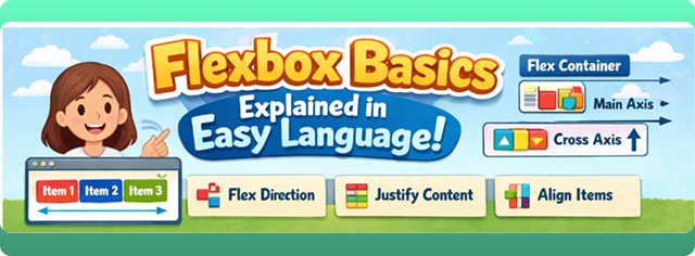
Flexbox, also known as the Flexible Box Layout, is a modern CSS layout model that makes it easy to design flexible and responsive layouts. In this blog, we will explain Flexbox basics in easy language, with simple examples that beginners can easily understand.
What Is Flexbox?
Flexbox is a CSS layout system designed to arrange elements in a row or a column and distribute space between them efficiently.
In simple words:
Flexbox helps you align, space, and arrange elements easily inside a container.
It is especially useful when:
- You want items in one line
- You want to center elements
- You want flexible and responsive layouts
Why Use Flexbox?
Before Flexbox, developers used floats and positioning, which were difficult and confusing. Flexbox solves many layout problems.
Advantages of Flexbox:
- Easy alignment (horizontal & vertical)
- Responsive by default
- Less CSS code
- Cleaner and readable layout logic
- Perfect for modern web design
Flexbox Terminology (Important)
Before using Flexbox, you should understand two basic terms:
1. Flex Container
The parent element where display: flex is applied.
2. Flex Items
The direct children inside the flex container.
Example:
.container {
  display: flex;
}
<div class="container">
  <div class="item">1</div>
  <div class="item">2</div>
  <div class="item">3</div>
</div>
Here:
.container→ Flex container.item→ Flex items
Flex Direction
The flex-direction property decides the direction of items.
Values:
row(default)row-reversecolumncolumn-reverse
Example:
.container {
  display: flex;
  flex-direction: row;
}
✔️ row → Items in a horizontal line
✔️ column → Items in a vertical line
Justify Content (Main Axis)
The justify-content property controls alignment along the main axis.
Common Values:
flex-startcenterflex-endspace-betweenspace-aroundspace-evenly
Example:
.container {
  display: flex;
  justify-content: center;
}
✔️ Perfect for horizontal centering
Align Items (Cross Axis)
The align-items property controls alignment along the cross axis.
Common Values:
stretch(default)centerflex-startflex-end
Example:
.container {
  display: flex;
  align-items: center;
}
✔️ Used for vertical alignment
Centering a Div Using Flexbox (Most Common Use)
One of the most popular uses of Flexbox is centering elements.
.container {
  display: flex;
  justify-content: center;
  align-items: center;
}
This centers content both horizontally and vertically.
Flex Wrap
By default, flex items try to fit in one line. The flex-wrap property allows items to move to the next line.
Example:
.container {
  display: flex;
  flex-wrap: wrap;
}
✔️ Useful for responsive layouts
Gap Property
The gap property controls space between flex items.
.container {
  display: flex;
  gap: 20px;
}
✔️ Cleaner than using margins
Flex Grow
The flex-grow property allows items to grow and take available space.
Example:
.item {
  flex-grow: 1;
}
✔️ All items share available space equally
Flex Shrink
The flex-shrink property controls how items shrink when space is limited.
.item {
  flex-shrink: 1;
}
✔️ Useful when screen size is small
Flex Basis
The flex-basis property sets the initial size of a flex item.
.item {
  flex-basis: 200px;
}
✔️ Similar to width, but more flexible
Short-Hand Flex Property
Instead of writing three properties, you can use shorthand:
.item {
  flex: 1 1 200px;
}
Order:
flex: grow shrink basis;
Align Self
The align-self property allows a single item to override align-items.
.item {
  align-self: flex-end;
}
✔️ Useful for special alignment
Real-Life Use Cases of Flexbox
Flexbox is commonly used for:
- Navigation bars
- Cards layout
- Buttons alignment
- Centering elements
- Responsive sections
Almost every modern website uses Flexbox.
Flexbox vs Old Layout Methods
| Feature | Flexbox | Float |
|---|---|---|
| Easy alignment | ✅ | ❌ |
| Responsive | ✅ | ❌ |
| Clean code | ✅ | ❌ |
| Modern | ✅ | ❌ |
Flexbox is clearly better for modern layouts.
Common Mistakes Beginners Make
- Forgetting to set
display: flex - Confusing main axis and cross axis
- Overusing fixed widths
- Not using
gap - Mixing Flexbox with floats
Best Practices for Beginners
- Use Flexbox for 1-D layouts
- Keep CSS simple
- Use
gapinstead of margins - Test layouts on different screen sizes
- Practice small layouts first
When Not to Use Flexbox?
Flexbox is best for one-direction layouts.
For complex two-dimensional layouts (rows + columns), CSS Grid is a better choice.
Conclusion
Flexbox is one of the most powerful and beginner-friendly layout systems in CSS. It makes alignment, spacing, and responsiveness much easier compared to old methods. By understanding Flexbox basics, you can create clean, flexible, and professional layouts with less effort.
For beginners, mastering Flexbox is an important milestone in learning CSS. With practice, you’ll find Flexbox simple, logical, and extremely useful for real-world web design.