When you start learning CSS, one of the most important concepts you will encounter is the position property. This property controls where an element appears on a web page. If you don’t understand it properly, you may struggle to align elements, create layouts, or even place content in the right spot.
In this guide, we will explain theCSS position property in the simplest way possible, with examples and real-life scenarios, so beginners can fully understand it. By the end of this article, you will know all types of positioning, how they work, and when to use them.CSS Position Property
What Is the CSS Position Property?
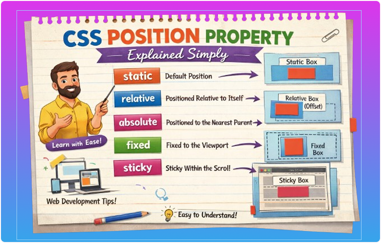
The CSS position property determines how an element is positioned on the page. It tells the browser whether an element should stay in the normal flow of the page, move relative to itself, relative to a parent, or be fixed on the screen.
Every HTML element has a default position of static, but CSS allows you to change this behavior to create flexible and precise layouts.CSS Position Property
Why Positioning Is Important in CSS
Positioning is one of the core skills in web design because it affects:
- Layout and structure of the page
- Element alignment
- Overlapping elements
- Fixed headers or sticky menus
- Popups, modals, tooltips, and dropdowns
Without understanding positioning, your layouts may look messy or break on different screen sizes.
Types of CSS Positioning
CSS provides five types of position values:
staticrelativeabsolutefixedsticky
Let’s explore each one in detail.
1. Static Position (Default)
Static is the default position for all elements.
- Elements appear in the normal flow of the page.
- Top, bottom, left, and right properties do not work.
- This is why most elements are naturally stacked one after the other.
Example:
p {
  position: static;
}
HTML:
<p>This is a static paragraph.</p>
<p>This is another paragraph.</p>
All paragraphs appear one below the other.
✅ Use static for normal content layout.
2. Relative Position
Relative positioning moves an element relative to its normal position.
- The space for the element in the page is preserved.
- You can use
top,bottom,left, andrightto move it slightly.
Example:
div {
  position: relative;
  top: 20px;
  left: 30px;
}
This moves the div 20px down and 30px to the right, without affecting other elements.
3. Absolute Position
Absolute positioning removes the element from the normal flow.
- It positions the element relative to its nearest positioned ancestor (
relative,absolute, orsticky). - If no ancestor is positioned, it uses the
<html>(page) as reference.
Example:
.container {
  position: relative;
}

.box {
  position: absolute;
  top: 10px;
  right: 10px;
}
.boxwill be placed 10px from the top and right of.container.- Other elements ignore it in the layout.
4. Fixed Position
Fixed positioning fixes the element relative to the viewport.
- It does not move when the page scrolls.
- Commonly used for sticky headers, navigation bars, or back-to-top buttons.
Example:
.header {
  position: fixed;
  top: 0;
  width: 100%;
  background-color: #333;
  color: white;
  text-align: center;
  padding: 10px;
}
- The header stays visible even when scrolling.
5. Sticky Position
Sticky positioning is a combination of relative and fixed.
- The element behaves like
relativeuntil it reaches a scroll position, then it sticks like fixed.
Example:
h2 {
  position: sticky;
  top: 0;
  background-color: yellow;
}
- As you scroll, the heading sticks at the top until its parent section ends.
How Top, Bottom, Left, Right Work
For relative, absolute, fixed, and sticky elements:
top: Moves element downbottom: Moves element upleft: Moves element rightright: Moves element left
Example:
div {
  position: absolute;
  top: 50px;
  left: 100px;
}
This places the element 50px from the top and 100px from the left of its positioned parent.CSS Position Property
Z-Index (Layering Elements)
The z-index property works with positioned elements (relative, absolute, fixed, sticky) to control stacking order.
Example:
.box1 {
  position: absolute;
  z-index: 1;
}

.box2 {
  position: absolute;
  z-index: 2;
}
.box2will appear on top of.box1.
✅ Useful for modals, popups, and overlays.CSS Position Property
Real-Life Use Cases of CSS Position
- Navigation menus – fixed or sticky headers
- Popups and tooltips – absolute positioning
- Cards and banners – relative or absolute
- Back-to-top buttons – fixed position
- Floating icons – fixed or sticky
Common Mistakes Beginners Make
- Using
absolutewithout a parentrelative - Ignoring default
staticbehavior - Confusing
fixedandsticky - Overlapping elements unintentionally
- Not testing across different screen sizes
Tips for Beginners
- Use
relativefor slight adjustments - Use
absolutefor exact placement within a container - Use
fixedfor elements that stay on the screen - Use
stickyfor scroll-based positioning - Always check layout in multiple screen sizes
Summary Table of Position Types
| Position | Description | Reference | Affects Flow |
|---|---|---|---|
| static | Default | Normal flow | Yes |
| relative | Moves relative to itself | Original position | Yes |
| absolute | Positions relative to nearest ancestor | Positioned ancestor or page | No |
| fixed | Stays on viewport | Viewport | No |
| sticky | Relative until threshold, then fixed | Scroll container | Yes/No |
Conclusion
The CSS position property is one of the most powerful tools in web design. Understanding static, relative, absolute, fixed, and sticky allows you to control element placement, layering, and responsiveness with precision.
For beginners, practicing different positioning techniques with real examples is the key to mastering CSS layouts. Once you understand positioning, creating professional, dynamic, and modern websites becomes much easier.CSS Position Property