When you start learning CSS, one concept appears again and again and often confuses beginners — the CSS Box Model. Many layout and spacing problems in web design happen simply because the box model is not clearly understood. Once you understand it properly, designing layouts becomes much easier and more predictable.
In this blog, we will explain the CSS Box Model in a simple, beginner-friendly way with clear examples. By the end of this article, you will understand how every HTML element behaves like a box and how CSS controls its size and spacing.
What Is the CSS Box Model?
The CSS Box Model is a fundamental concept that describes how HTML elements are structured and displayed on a web page.
In CSS, every element is treated as a rectangular box. This box consists of different layers that control spacing, borders, and content.
In simple words:
The CSS Box Model explains how much space an element takes on a web page and how that space is calculated.
Why Is the CSS Box Model Important?
Understanding the CSS Box Model is important because:
- It controls spacing between elements
- It helps create proper layouts
- It prevents unexpected design issues
- It improves responsive design
- It makes CSS behavior predictable
Most beginner CSS problems like “Why is this element so big?” or “Why is there extra space?” are related to the box model.
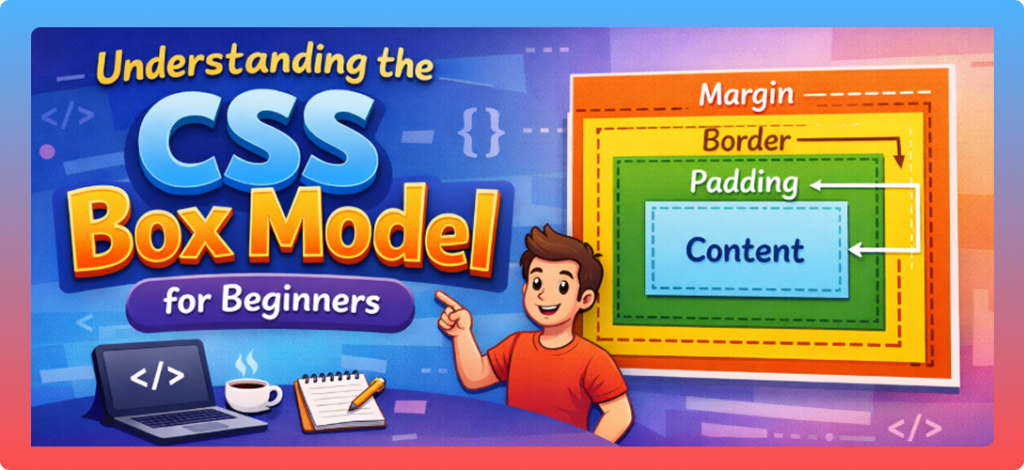
The Four Parts of the CSS Box Model
The CSS Box Model has four main parts:
- Content
- Padding
- Border
- Margin
Let’s understand each part one by one.
1. Content
The content is the actual area where text, images, or other content appears.
Example:
div {
  width: 200px;
  height: 100px;
}
This defines the size of the content area only.
✔️ Text and images stay inside the content box
✔️ Width and height apply to content by default
2. Padding
Padding is the space between the content and the border. It creates inner spacing inside the element.
Example:
div {
  padding: 20px;
}
This adds space inside the element, pushing content away from the border.
Key points about padding:
- Padding increases the total size of the element
- Padding is transparent
- Background color extends into padding
3. Border
The border wraps around the padding and content. It is visible and helps define the edge of an element.
Example:
div {
  border: 2px solid black;
}
Key points:
- Border adds to element size
- Border can have different styles and colors
- Border sits between padding and margin
4. Margin
Margin is the outermost space around an element. It creates distance between elements.
Example:
div {
  margin: 30px;
}
Key points:
- Margin creates space outside the element
- Margin is always transparent
- Vertical margins can collapse
Visual Structure of the Box Model
The box model can be imagined like this:
Margin
 └── Border
      └── Padding
           └── Content
Every HTML element follows this structure, whether it is a div, p, button, or img.
How Box Size Is Calculated
By default, the total size of an element is calculated like this:
Total Width = content width + padding + border + margin
Total Height = content height + padding + border + margin
Example:
div {
  width: 200px;
  padding: 20px;
  border: 5px solid black;
  margin: 10px;
}
Total width calculation:
- Content: 200px
- Padding: 20px × 2 = 40px
- Border: 5px × 2 = 10px
- Margin: 10px × 2 = 20px
Total width = 270px
This surprises many beginners.
The box-sizing Property
To solve size confusion, CSS provides the box-sizing property.
Default Behavior:
box-sizing: content-box;
This is the default value, where width and height apply only to content.
Using box-sizing: border-box
This is the most recommended option for beginners and professionals.
Example:
div {
  box-sizing: border-box;
  width: 200px;
  padding: 20px;
  border: 5px solid black;
}
Now:
- Padding and border are included inside the width
- Total width remains 200px
✔️ Layout becomes easier
✔️ No unexpected size increase
Global box-sizing Best Practice
Most developers use this rule:
* {
  box-sizing: border-box;
}
This applies border-box to all elements and simplifies layout design.
Margin Collapse (Important Concept)
Vertical margins can sometimes collapse.
Example:
p {
  margin: 20px 0;
}
If two paragraphs are stacked, the margin between them will be 20px, not 40px.
Key points:
- Only vertical margins collapse
- Horizontal margins do not collapse
- Padding and border prevent margin collapse
Box Model and Inline vs Block Elements
Block Elements
- Take full width
- Respect width, height, margin, padding
- Example:
div,p,section
Inline Elements
- Take only content width
- Width and height do not apply
- Example:
span,a
Understanding this helps control spacing correctly.
Real-Life Use of the CSS Box Model
The box model is used everywhere:
- Page layouts
- Cards and sections
- Buttons and forms
- Navigation menus
- Responsive designs
Every spacing and alignment depends on the box model.
Common Mistakes Beginners Make
- Forgetting padding adds size
- Not using
box-sizing: border-box - Confusing margin and padding
- Ignoring margin collapse
- Overusing fixed widths
Avoiding these mistakes will save a lot of time.
Best Practices for Beginners
- Always understand element size calculation
- Use
box-sizing: border-box - Use padding for inner spacing
- Use margin for outer spacing
- Test layout using browser DevTools
How to Practice the Box Model
To master the box model:
- Inspect elements using browser DevTools
- Change padding, border, margin live
- Build simple cards and layouts
- Experiment with box-sizing
Practice makes this concept very clear.
Conclusion
The CSS Box Model is the backbone of layout and spacing in web design. Every HTML element behaves like a box made of content, padding, border, and margin. Once you understand how these parts work together, CSS becomes much more logical and easy to control.
For beginners, mastering the box model is a big step toward becoming confident in CSS. With proper practice and understanding, you can avoid layout problems and design clean, professional websites.